

Design Sprint Timeline: 8 days
Hackathon Timeline: 3 days
Design Team: Allison Putnam, Erin Rowland
Software Engineers: Fahad Hussain, Christopher Duggan, Shaniece Crumpler
Role: Scrum master, UX Researcher, Interviews, Usability Testing
Tools: Sketch, InVision, Zeplin
Project Overview
Finding a program to further your education could get overwhelming and frustrating. Good Apples helps streamline the process for working adults interested in furthering their education by helping them choose courses that would fit their budget and lifestyle.
We teamed up with software engineers in a hackathon and created a functional product.
The Challenge
My team and I wanted to create a platform that helps busy professionals streamline the search process of a school/program that best fits their criteria. How can we quickly and easily help people interested in furthering their education by streamlining the school search process?

Introducing Good Apples

Discover
Problem Space
Before tackling the issue of finding the right program or course, we had to clearly identify the core problem.
From interviewing 7 users, we discovered that users did research online and then spoke to people in person. Many relied on school websites for details but were skeptical of the credibility of some of the programs offered. Ultimately recommendation from a friend or acquaintance enabled users to come to a decision on a specific direction or program.
Affinity Map
To understand more about the search process of a program, I came up with an affinity map. The goal was the find important keywords from the interviews we conducted, and from there find key features for our website.

There were 3 main factors that were forefront in the users' mind when they were thinking about going back to school.

Money
People were concerned with getting a bang for their buck. People were willing to invest in themselves but wanted to be sure the cost of the school/program was worth it. They wanted to feel confident they would be able to find quality work after finishing the program and that they would be in a better place financially in the long run

Time
The time schools required from them was also a big factor. People were looking for a balance between feeling prepared for a career in their new field and making the transition quickly

Credibility
The credibility of the school was also a major factor. People needed some kind of social reassurance that this was a good decision. People were very skeptical of specific programs, but after they spoke to someone who had a positive experience, they had more faith in the credibility of the institution. Even after personal recommendations, this thought lingered in their minds.
We were able to curate our findings into a persona and a journey map. Both of which were very useful in keeping our users in mind throughout the design process.
Define
User Persona
This is P.J. P.J. is a head server in New York City but felt like it was a dead end job and is looking for a change. P.J. is conflicted with all the information presented to her online and big decisions overwhelm her. What she needs is somewhere to go to that can help her find exactly what she is looking for.

P.J. Mask
"I got to a point where I felt that there wasn't room to grow. I was ready for the next step."
Goals:
- Challenge herself
- Start her career
Pain Point:
- Money is tight
- Doesn't have time to waste
Needs:
- Regular hours
- Financial stability
Behaviors:
- Finds big decisions overwhelming
- Values friends' advice
Journey Map

How might we simplify the process of choosing the right program based on the P.J.'s preferences?
Problem Statement
MoSCoW Map
We came up with different features of what we thought was a must have, should have, could have, and won't have. This helped us determine what we needed for our website.


Develop
Design Studio
We did a design studio separately and came back together and discussed what we each came up with and compared the pros and cons. We each gave feedback to the other 2 group members. We then iterated on the best version of our ideas.
Our idea was to have the user take a quiz and based on their answers the user would get filtered results with personalized recommendations. Upon receiving the results, the recommendations would have a 'alumni you may know' where the user could turn to their personal network for advice and support.


Low-Fidelity Wireframes / Paper Prototypes
After our design studio, we came back together and then iterated on the best version of our ideas which became our paper prototypes. This is a rough concept of what our website would look like. Designing the low-fidelity wireframes helped us visualize the features before starting the mid-fidelity and high-fidelity prototypes.

Mid-Fidelity Wireframes
After coming up with our paper prototypes and deciding on the best iteration, we went to Sketch and made our mid-fidelity wireframes. We all worked together on the wireframes and once we were done, we tested our prototype.


We tested on 3 users and some key findings from our usability testing:
-
Our lack of copy in the fields did not provide the users with enough information or context to move through our site.
-
Text should be bigger to improve readability
-
Users wanted to click on 'Pop Quiz' before any tasks were given, but wasn't sure what it would do.
High-Fidelity Wireframes
Taking the results of the mid-fidelity wireframe usability testings, we made the necessary adjustments and designed our high-fidelity wireframes.


Collaborating with Software Engineers / Hackathon
When we initially met with the developers we had to discuss and plan what we could do in the short amount of time that we had.
Based on our final product, the software engineers had given us feedback on what was and was not feasible within the timeframe.
MoSCoW Map (Revised)
We quickly created another MoSCow map which, again, helped in our decision of what was needed and what could be done.

Design Studio
With the software engineers this time, we did another design studio and created a rough design of the final product based on our MoSCoW map. This helped both sides clarify what was expected.

Low-Fidelity Wireframes / Paper Prototypes
After our design studio with the software engineers, the design team created another set of paper prototypes

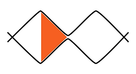
With this iteration, we introduced a progress indicator that would fill the screen as the user progressed through the quiz.
All the users were able to get through the quiz but the progress indicator was not self-evident, which resulted in us redesigning to a traditional progress bar.
Handoff to Developers

Following the agile method, we provided the software engineers with the wireframes we had created along with the user flows. The developers were able to start building the back end of the site.
Once we finished testing our product, we provided the software engineers with our designs through Zeplin so they could finish the front end portion of our site.
Deliver
Final Design
We made iterations based on the feedback we gathered from our usability testing and software engineers and came up with our high-fidelity wireframe.
Landing/Home Page
This is the first thing users would see upon arrival to our website. From our research, users were not sure what the 'Pop Quiz' button would do so we changed the copy to 'Find My Course' which provided more context.

Questions
As users click the 'Find My Course' they would start the process of finding the course that was right for them through a series of 9 questions that asked them their preferences.

Results Page
Once users have gone through all the questions, our system would match the user with the best school based on the users' answers.
The results are broken down into price, duration of course, credibility of course, and location.

Next Steps
-
Assign importance to answers based on the users' preference
-
Show indication that the user has completed the quiz
-
Bold key figures in the report card to clarify information
What I Learned
While working with software engineers, I got a better understanding of how the "other side" worked in the development process. There are many moving parts and certain things are feasible compared to others, especially when time is a factor.
Just like the world of "UX," communication was key. We had to constantly be in contact with each other making sure things were going as planned or if there were any blockers.
Having software engineers collaborate with us during the design studio was helpful to see how they thought and interpreted things. This helped us better empathize with each other.